THE BRIEF:
To create the brand and identity for ethical carpentry and set building company based in East London.
The brand's values centre on creativity, sustainability, and utility which needed to be communicated
through the identity.
The brand's values centre on creativity, sustainability, and utility which needed to be communicated
through the identity.
THE SOLUTION:
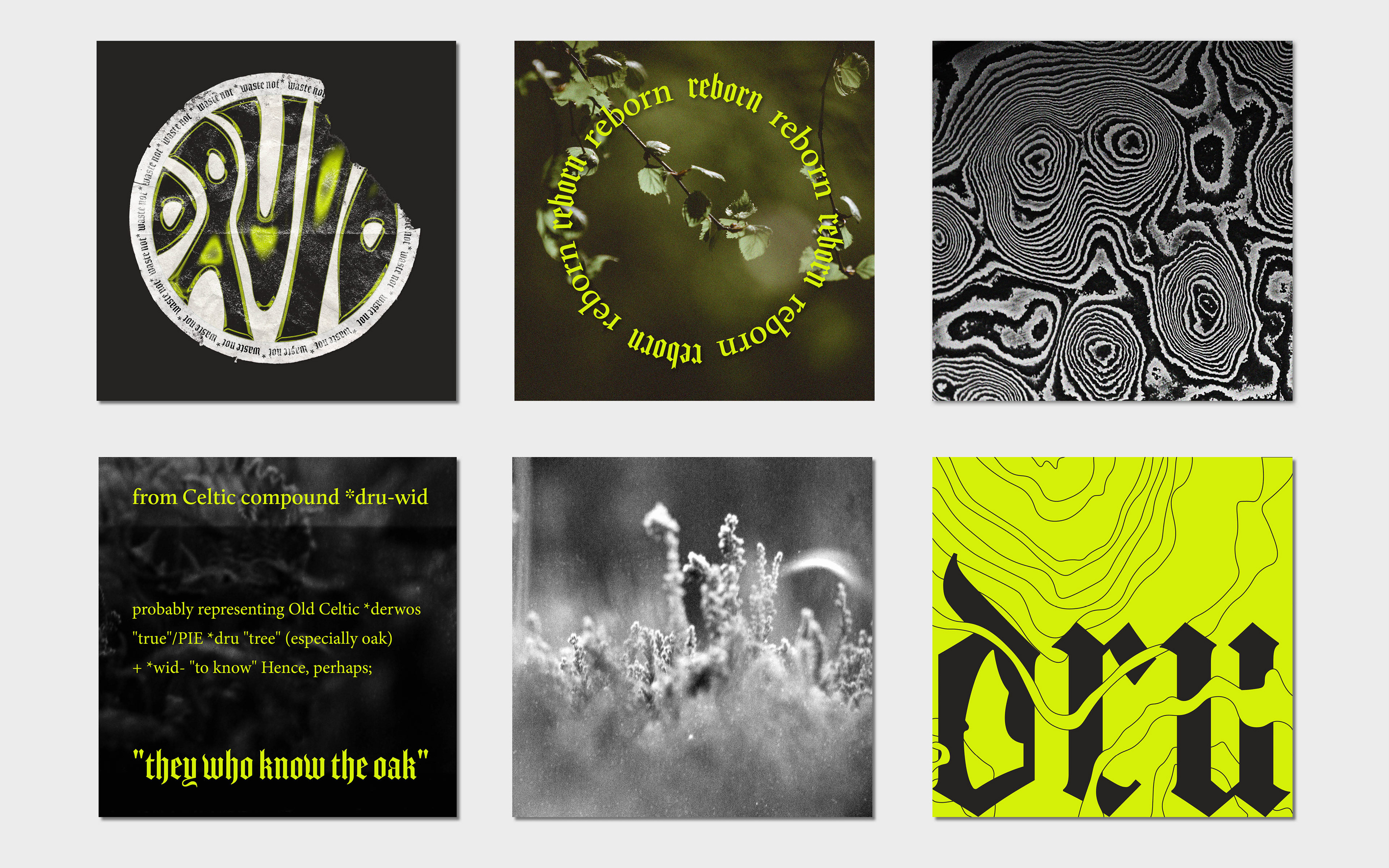
The word carpenter is derived from the Celtic Gauls, 6th-century European Druids. Modern Druid philosophy
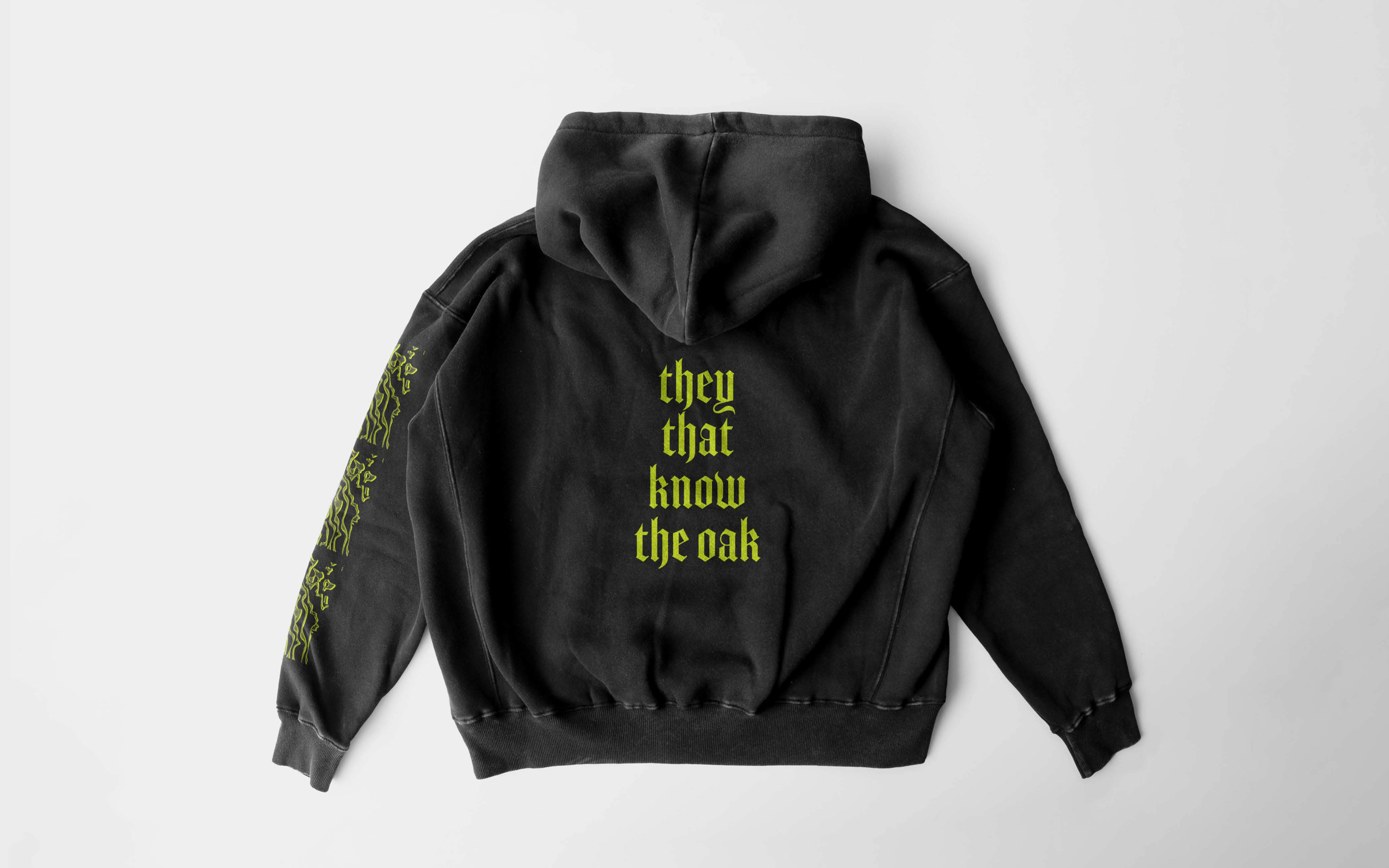
centers on harmony, connection, and reverence with the natural world as well as, creativity and craft perfectly in line with the brand's values. From there the brand name and direction was born - Druid literally translates as ‘they that know the oak,’ which became the brand tag line communicating both their knowledge and reverence for the natural world.
centers on harmony, connection, and reverence with the natural world as well as, creativity and craft perfectly in line with the brand's values. From there the brand name and direction was born - Druid literally translates as ‘they that know the oak,’ which became the brand tag line communicating both their knowledge and reverence for the natural world.
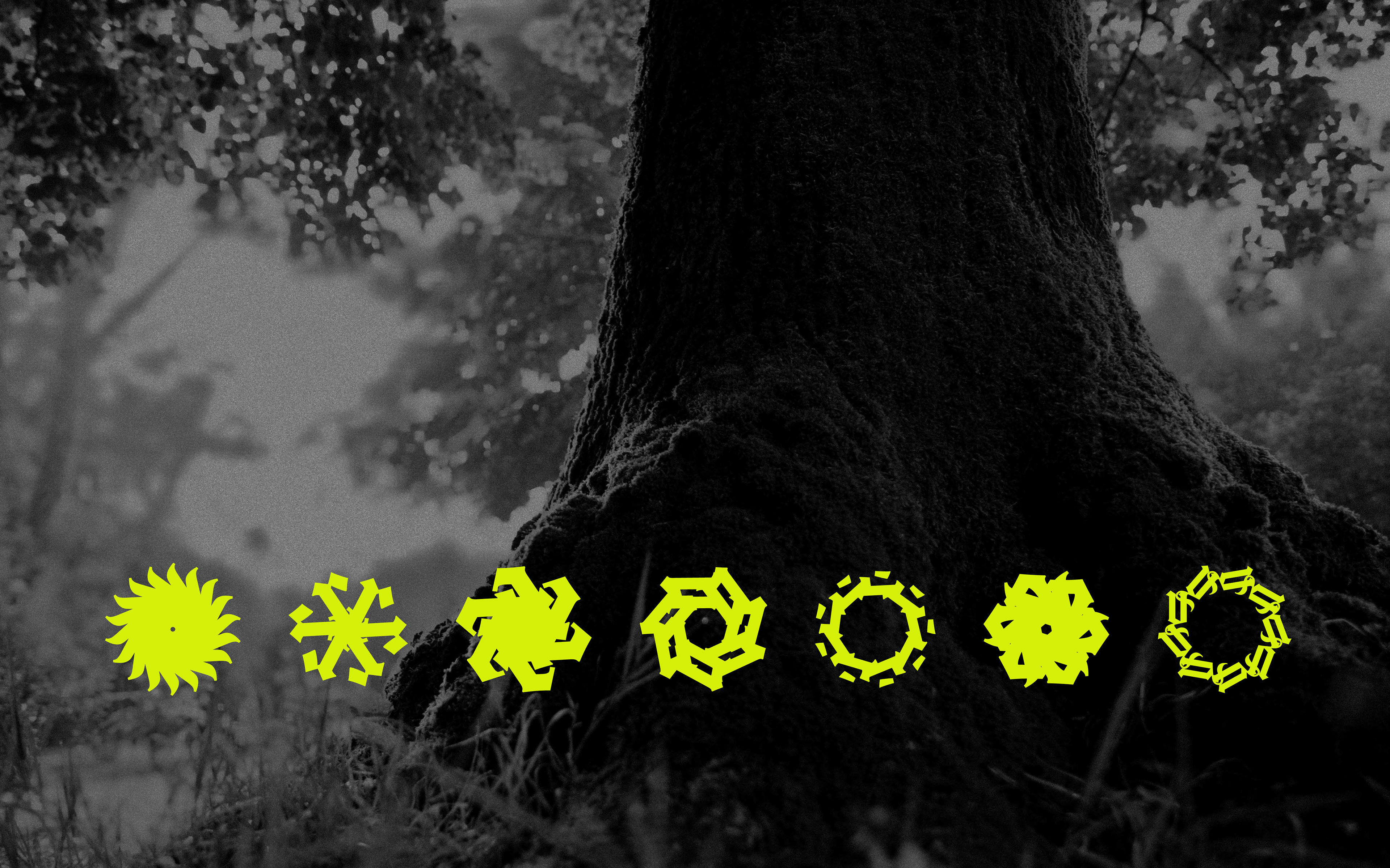
The logo was created from Amador typeface combined with the head of a traditional Celtic Druid axe. Amador is a medieval-inspired font that was inspired by Rudolph Koch. Koch curated a book of medieval and primitive symbols in his book of Signs which was cited as a key reference for the client. The seven graphic elements also tie in with Koch’s signs, created using the letters which make up the word Druidry, they act as a nod to the seven gifts of Druidry which centre around geocentric philosophy whilst also communicating reusing and recycling, they also resemble saw blades.